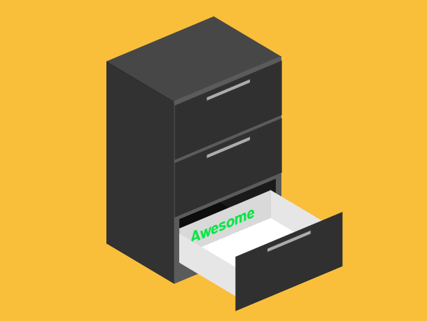
This is a drawer opening and closing animation based on pure CSS3. There are 3 layers of drawers, and each layer is marked with a name, which can only be seen when the drawer is opened. When you click a drawer with the mouse, the drawer will open, and click again to close it. Of course, this animation may not be very helpful to your practical application, but it can let you learn a lot about CSS3 animation characteristics.
Advertisement
<div class="chest__panel chest__panel--back"></div>
  <div class="chest__panel chest__panel--front">
    <div class="chest__panel chest__panel--front-frame"></div>
  </div>
  <div class="chest__panel chest__panel--top"></div>
  <div class="chest__panel chest__panel--bottom"></div>
  <div class="chest__panel chest__panel--left"></div>
  <div class="chest__panel chest__panel--right"></div>
  <div class="chest-drawer chest-drawer--top">
    <details>
      <summary></summary>
    </details>
    <div class="chest-drawer__structure">
      <div class="chest-drawer__panel chest-drawer__panel--left"></div>
      <div class="chest-drawer__panel chest-drawer__panel--right"></div>
      <div class="chest-drawer__panel chest-drawer__panel--bottom"></div>
      <div class="chest-drawer__panel chest-drawer__panel--back">CSS</div>
    </div>
  </div>
body {
  align-items: center;
  background-color: #f9bf3b;
  display: flex;
  justify-content: center;
  min-height: 100vh;
}
:root {
  --height: 300;
  --width: 200;
  --depth: 150;
  --drawerSize: calc((var(--height) / 3) - 10);
  --drawerHole: calc((var(--height) - ((10 * 4) + (10 + 30))) / 3);
}
.chest {
  height: calc(var(--height) * 1px);
  -webkit-transform: rotateX(-30deg) rotateY(40deg);
          transform: rotateX(-30deg) rotateY(40deg);
  -webkit-transform-style: preserve-3d;
          transform-style: preserve-3d;
  width: calc(var(--width) * 1px);
}
.chest__panel {
  height: 100%;
  position: absolute;
  -webkit-transform-style: preserve-3d;
          transform-style: preserve-3d;
  width: 100%;
}
.chest__panel:after {
  content: '';
  display: block;
  height: 100%;
  width: 100%;
}
Advertisement