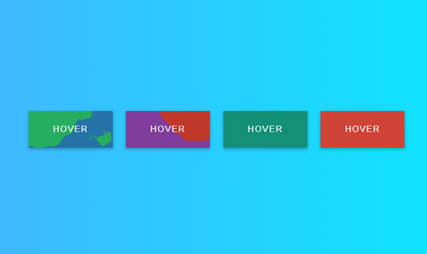
Today I will share with you a very useful CSS3 shopping cart image plug-in. Its function is that when you hover the mouse over the shopping cart image, the image will switch to another image, and a layer with operation buttons will be generated above the image. For the mask layer, you can define operations such as sharing, comparison, and search, and you can also add and delete small buttons yourself.
Advertisement
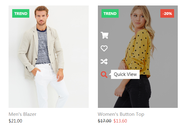
<div class="col-md-3 col-sm-6">
			<div class="product-grid">
				<div class="product-image">
					<a href="#">
						<img class="pic-1" src="images/img-1.jpg">
						<img class="pic-2" src="images/img-2.jpg">
					</a>
					<span class="product-trend-label">Trend</span>
					<ul class="social">
						<li><a href="#" data-tip="Add to Cart"><i class="fas fa-shopping-cart"></i></a></li>
						<li><a href="#" data-tip="Wishlist"><i class="far fa-heart"></i></a></li>
						<li><a href="#" data-tip="Compare"><i class="fas fa-random"></i></a></li>
						<li><a href="#" data-tip="Quick View"><i class="fas fa-search"></i></a></li>
					</ul>
				</div>
				<div class="product-content">
					<h3 class="title"><a href="#">Men's Blazer</a></h3>
					<div class="price">$21.00</div>
				</div>
			</div>
		</div>
*,
*:after,
*:before {
	-webkit-box-sizing: border-box;
	-moz-box-sizing: border-box;
	box-sizing: border-box;
}

.clearfix:before,
.clearfix:after {
	content: " ";
	display: table;
}

.clearfix:after {
	clear: both;
}

body{
	background: #494A5F;
	color: #D5D6E2;
	font-weight: 500;
	font-size: 1.05em;
	font-family: "Microsoft YaHei","Segoe UI", "Lucida Grande", Helvetica, Arial,sans-serif;
}
Advertisement