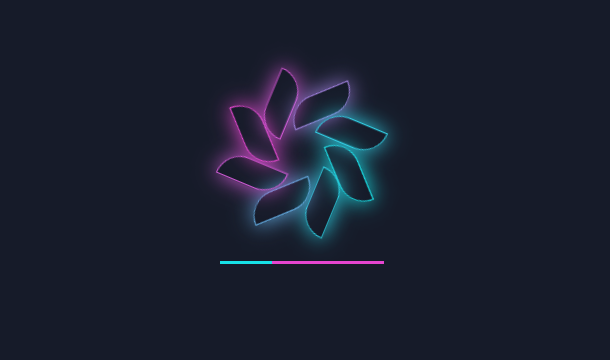
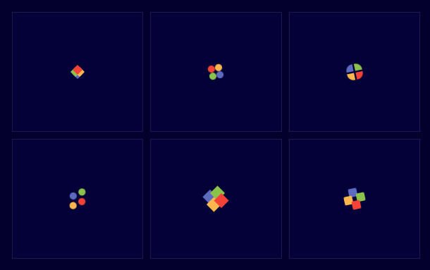
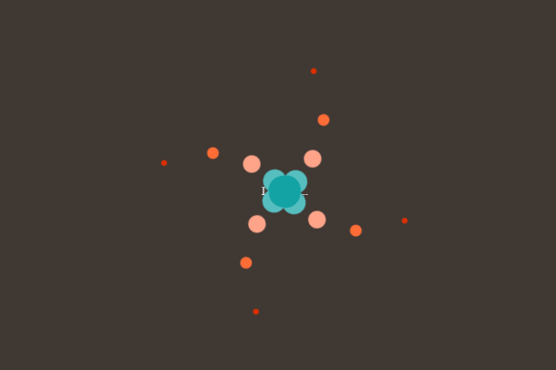
This time we introduce a vortex style CSS3 Loading loading animation, it looks like a cool spinning when loading, and there is a loading word in the middle to indicate that it is loading content.
Advertisement
<div class="loader">
	<div class="text">Loading...</div>
	<div class="horizontal">
	  <div class="circlesup">
			<div class="circle"></div>
			<div class="circle"></div>
			<div class="circle"></div>
			<div class="circle"></div>
			<div class="circle"></div>
	  </div>
	  <div class="circlesdwn">
			<div class="circle"></div>
			<div class="circle"></div>
			<div class="circle"></div>
			<div class="circle"></div>
			<div class="circle"></div>
	  </div>
	</div>
	<div class="vertical">
	  <div class="circlesup">
			<div class="circle"></div>
			<div class="circle"></div>
			<div class="circle"></div>
			<div class="circle"></div>
			<div class="circle"></div>
	  </div>
	  <div class="circlesdwn">
			<div class="circle"></div>
			<div class="circle"></div>
			<div class="circle"></div>
			<div class="circle"></div>
			<div class="circle"></div>
	  </div>
	</div>
</div>
.loader {
	position: absolute;
	top: 50%;
	left: 50%;
	-webkit-transform: translate(-50%, -50%);
	-moz-transform: translate(-50%, -50%);
	-mos-transform: translate(-50%, -50%);
	-o-transform: translate(-50%, -50%);
	transform: translate(-50%, -50%);
	text-align:center;
	-webkit-touch-callout: none;
    -webkit-user-select: none;
    -khtml-user-select: none;
    -moz-user-select: none;
    -ms-user-select: none;
    user-select: none;
    cursor:default;
}

.text{
	position: absolute;
	left: -1.3em;
	top: -1.7em;
	-webkit-animation: text 2s infinite;
	-moz-animation: text 2s infinite;
	-moz-animation: text 2s infinite;
	-ms-animation: text 2s infinite;
	-o-animation: text 2s infinite;
	animation: text 2s infinite;
}
Advertisement