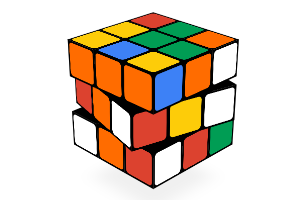
This time we are sharing a cube based on HTML5 and CSS3, but to be precise, it is a Rubik’s Cube. It is not just as simple as coloring each surface of the cube. You can really turn the Rubik’s Cube. Drag the blank space to select the magic aspect you want to view.
Advertisement
<div id="uipanel" class="fadeTransition" style="display:none">
  <div id="movecounter">0</div>
  <div id="buttonpanel">
	<div id="sharebubble" class="fadeTransition" style="opacity:0">
	  <input id="shareshortlink" type="text" value="google.com/doodles" readonly/>
	  <div id="sharegplus" class="bubbleicon SPRITE_google_plus_64_2x"></div>
	  <div id="sharefacebook" class="bubbleicon SPRITE_facebook_64_2x"></div>
	  <div id="sharetwitter" class="bubbleicon SPRITE_twitter_64_2x"></div>
	  <div id="shareemail" class="bubbleicon SPRITE_email_64_2x"></div>
	</div>
	<div id="uibuttons">
	  <div id="sharebutton" class="bubbleicon SPRITE_share_64_2x"></div>
	  <div id="helpbutton" class="bubbleicon SPRITE_help_64_2x"></div>
	  <div id="searchbutton" class="bubbleicon SPRITE_search_64_2x"></div>
	</div>
  </div>
  <div id="helpbubble" class="bubble" style="display:none">
	<span class="pointerup SPRITE_carrot_grey_up_2x"></span>
	<div id="helpimage" class="one"></div>
	<div id="helptext" class="helptext"></div>
	<div id="helpnext" class="helptext"></div>
	<span class="pointerdown SPRITE_carrot_down_2x"></span><br>
  </div>
</div>
.cube {
 width:  100%;
 height: 100%;
}
.faceLabel {
 display: none;
 position: absolute;
 font-size: 60px;
 text-align: center;
 text-shadow: 0 0 24px rgba( 0, 0, 0, 0.3 );
 color: #FFF;
}
.cube .cubelet {
 width:  1em;
 height: 1em;
 position: absolute;
 box-sizing: border-box;
}
.cube .face {
 position: absolute;
 width:  1em;
 height: 1em;
 background-color: #000;
 text-align: center;
 -webkit-backface-visibility: hidden;
   -moz-backface-visibility:    hidden;
   -o-backface-visibility:      hidden;
   backface-visibility:         hidden;
   padding: 0.05em;
   -moz-box-sizing: border-box;
   -webkit-box-sizing: border-box;
   -o-box-sizing: border-box;
   -ms-box-sizing: border-box;
 box-sizing: border-box;
}
var container = document.getElementById('container');
container.appendChild(cube.domElement);
if (isMobile) {
  document.body.classList.add('mobile');
  document.getElementById('bg').classList.add('graydient');
}
cube.addEventListener('click', function(evt) {
  if (!cube.mouseControlsEnabled) {
    return;
  }
  var cubelet = evt.detail.cubelet,
      face = cubelet[evt.detail.face.toLowerCase()],
      axis = new THREE.Vector3(),
      exclude = new THREE.Vector3(1, 0, 0),
      UP = new THREE.Vector3(0, 1, 0),
      normal = ERNO.Direction.getDirectionByName(face.normal).normal.clone(),
      slice;
  normal.x = Math.abs(normal.x);
  normal.y = Math.abs(normal.y);
  normal.z = Math.abs(normal.z);
  var l = cube.slices.length;
  while (l-- > 0) {
    slice = cube.slices[l];
    axis.copy(slice.axis);
    axis.x = Math.abs(axis.x);
    axis.y = Math.abs(axis.y);
    axis.z = Math.abs(axis.z);
    if (slice.cubelets.indexOf(cubelet) !== -1 &&
        axis.equals(UP)) {
      break;
    }
  }
  var command = slice.name.substring(0, 1);
  if (slice === cube.down) command = command.invert();
  cube.twist(command);
});
Advertisement