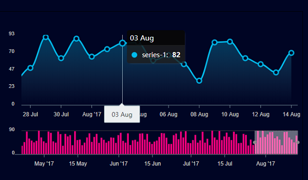
ApexCharts is a modern chart library based on JavaScript and HTML5 with very powerful functions. The curve chart to be shared today is based on ApexCharts. The chart is finally displayed on the browser in the form of SVG. Another feature of this chart is that you can customize the range of selected data. After the range is determined, the graph and the bar graph in the range are displayed in the chart at the same time. Similarly, there is this HTML5 Canvas chart application Chart.js
Advertisement
var data = generateDayWiseTimeSeries(new Date("22 Apr 2017").getTime(), 115, {
  min: 30,
  max: 90
});
var options1 = {
  chart: {
    id: "chart2",
    type: "area",
    height: 230,
    foreColor: "#ccc",
    toolbar: {
      autoSelected: "pan",
      show: false
    }
  },
  colors: ["#00BAEC"],
  stroke: {
    width: 3
  },
  grid: {
    borderColor: "#555",
    yaxis: {
      lines: {
        show: false
      }
    }
  },
  dataLabels: {
    enabled: false
  },
  fill: {
    gradient: {
      enabled: true,
      opacityFrom: 0.55,
      opacityTo: 0
    }
  },
  markers: {
    size: 5,
    colors: ["#000524"],
    strokeColor: "#00BAEC",
    strokeWidth: 3
  },
  series: [
    {
      data: data
    }
  ],
  tooltip: {
    theme: "dark"
  },
  xaxis: {
    type: "datetime"
  },
  yaxis: {
    min: 0,
    tickAmount: 4
  }
};
body {
  background: #000524;
}

#wrapper {
  padding-top: 20px;
  background: #000524;
  border: 1px solid #000;
  box-shadow: 0 22px 35px -16px rgba(0, 0, 0, 0.71);
  max-width: 650px;
  margin: 35px auto;
}

#chart-bar {
  position: relative;
  margin-top: -38px;
}
Advertisement