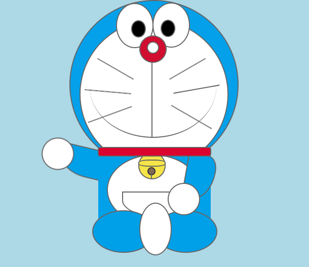
Very early on, we shared a pure CSS3 implementation of Jingle cat, the eyes will follow the mouse scroll, very cute. This time I bring you another Jingle cat, a waved Doraemon Doraemon, which is an upgraded version of the previous one, because it will not only roll your eyes, but also wave your hands, but these are only through CSS3 Code implementation.
Advertisement
<div id="main">
	<header>
		<nav class="face"></nav>
		<nav class="eye_1"></nav>
		<nav class="eye_11"></nav>
		<nav class="eye_2"></nav>
		<nav class="eye_22"></nav>
		<nav class="nose"></nav>
		<nav class="white"></nav>
		<nav class="mouth1"></nav>
		<nav class="mouth2"></nav>
		<div class="mustache_1"></div>
		<div class="mustache_2"></div>
		<div class="mustache_3"></div>
		<div class="mustache_4"></div>
		<div class="mustache_5"></div>
		<div class="mustache_6"></div>
	</header>
	<article>
		<div class="bozi"></div>
		<div class="main"></div>
		<div class="arm"></div>
		<div class="arm_2"></div>
		<div class="hand"></div>
		<div class="hand_2"></div>
		<div class="bell_1"></div>
		<div class="bell_2"></div>
		<div class="bell_3"></div>
		<div class="bell_4"></div>
		<div class="heaith_1"></div>
		<div class="heaith_2"></div>
		<div class="heaith_3"></div>
		<div class="heaith_4"></div>
		<div class="footer"></div>
	</article>
</div>
#main{width:640px;height:550px;background:lightblue;margin:0 auto;position:relative;margin-top:30px;}
	header{width:330px;height:330px;background:#04a0ea;border-radius:50%;margin-left:150px;border:2px solid #666;}
	.face{width:290px;height:290px;background:#fff;border-radius:50%;position:relative;top:37px;border:2px solid #666;
		left:18px;}
	.eye_1{width:70px;height:85px;border:2px solid #666;border-top-left-radius:70px;background:#fff;z-index:2;
		position:relative;left:90px;top:-290px;border-radius:50%;}
	.eye_11{width:25px;height:30px;border:2px solid #666;background:#000;border-radius:50%;z-index:3;
		position:relative;left:120px;top:-345px;
		animation-name:myFrame1;
		animation-duration:2s;
		animation-iteration-count:infinite;
		animation-direction:alternate;
		}
	@keyframes myFrame1{
				0%{transform:translateX(-20px);};
		50%{transform:translateX(20px);};
		100%{transform:translateX(-20px);};
			}
	.eye_2{width:70px;height:85px;border:2px solid #666;border-top-left-radius:70px;background:#fff;z-index:2;
		position:relative;left:162px;top:-414px;border-radius:50%;}
	.eye_22{width:25px;height:30px;border:2px solid #666;background:#000;border-radius:50%;z-index:3;
		position:relative;left:178px;top:-469px;
		animation-name:myFrame2;
		animation-duration:2s;
		animation-iteration-count:infinite;
		animation-direction:alternate;
		}
	@keyframes myFrame2{
		0%{transform:translateX(20px)};
		50%{transform:translateX(-20px)};
		100%{transform:translateX(20px)}
	}
Advertisement