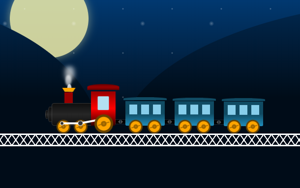
Since the popularity of CSS3, animations based on pure CSS3 have emerged one after another, including pure CSS3 character animations, pure CSS3 button animations and so on. This time, we will share with you a very good CSS3 cartoon train running along the track animation. A cartoon-style train slowly passes by, especially the animation design of the locomotive, which is very cute and realistic.
Advertisement
<div class="center">
  <div class="mountains"></div>
  <div class="train">
    <div class="engine-front">
      <div class="chimney">
        <div class="smoke"></div>
        <div class="smoke smoke-2"></div>
        <div class="smoke smoke-3"></div>
        <div class="smoke smoke-4"></div>
      </div>
    </div>
    <div class="engine-body"></div>
    <div class="compartment">
      <div class="compartment-window"></div>
    </div>
    <div class="compartment compartment-two">
      <div class="compartment-window"></div>
    </div>
    <div class="compartment compartment-three">
      <div class="compartment-window"></div>
    </div>
    <div class="wheel-holder">
      <div class="wheel"></div>
      <div class="wheel wheel-2">
        <div class="wheel-joint"></div>
        <div class="wheel-joint wheel-joint-2"></div>
      </div>
      <div class="wheel wheel-3"></div>
      <div class="wheel wheel-4"></div>
      <div class="wheel wheel-5"></div>
      <div class="wheel wheel-6"></div>
      <div class="wheel wheel-7"></div>
      <div class="wheel wheel-8"></div>
      <div class="wheel wheel-9"></div>
    </div>
  </div>
  <div class="bridge"></div>
</div>
body {
  font-family: 'Ubuntu', sans-serif;
  color: #6e6e6e;
  font-size: 1.6rem;
}

header, footer {
  display: block;
}

a, a:link, a:visited {
  color: #4d4d4d;
  text-decoration: none;
}

img {
  border: 0;
}

ul {
  list-style: none;
}

.center {
  background: #000c18;
  background: -webkit-linear-gradient(#013971, #000c18 60%);
  background: -moz-linear-gradient(#013971, #000c18 60%);
  background: -o-linear-gradient(#013971, #000c18 60%);
  background: -ms-linear-gradient(#013971, #000c18 60%);
  background: linear-gradient(#013971, #000c18 60%);
  height: 40rem;
  margin: auto;
  overflow: hidden;
  position: relative;
  width: 110rem;
}
Advertisement