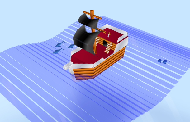
This time we want to share another pure CSS3-based 3D pirate ship animation, the animation is divided into two parts, one is the appearance of the pirate ship drawn with CSS3, the sails will shake in the wind, and another is the surface of the sea, the ship is moving forward in the wind on the sea, very realistic.
Advertisement
<div class="dolphin">
            <div class="dolphin_move">
              <div class="dolphin_z">
                <div class="dolphin_rotate">
                  <div class="body fish_2"></div>
                  <div class="front_fin fish_1"></div>
                  <div class="back_fin fish_1"></div>
                </div>
              </div>
            </div>
          </div>
          <div class="dolphin">
            <div class="dolphin_move">
              <div class="dolphin_z">
                <div class="dolphin_rotate">
                  <div class="body fish_2"></div>
                  <div class="front_fin fish_1"></div>
                  <div class="back_fin fish_1"></div>
                </div>
              </div>
            </div>
          </div>
div {
  -webkit-transform-style: preserve-3d;
          transform-style: preserve-3d;
  position: absolute;
}

#open_water {
  -webkit-perspective: 800px;
          perspective: 800px;
  -webkit-filter: drop-shadow(0 220px 20px rgba(0, 20, 150, 0.3));
          filter: drop-shadow(0 220px 20px rgba(0, 20, 150, 0.3));
}
@-moz-document url-prefix() {
  #open_water {
    filter: none;
  }
}
#open_water .tree_1 {
  background: -webkit-gradient(linear, left bottom, left top, from(#470d04), color-stop(5%, #ea831c), color-stop(12%, #ea831c), color-stop(20%, #894d10), color-stop(25%, #6b190c), color-stop(26%, #470d04), color-stop(28%, #ea831c), color-stop(36%, #ea831c), color-stop(45%, #894d10), color-stop(50%, #6b190c), color-stop(51%, #470d04), color-stop(53%, #ea831c), color-stop(61%, #ea831c), color-stop(70%, #894d10), color-stop(75%, #6b190c), color-stop(76%, #470d04), color-stop(78%, #ea831c), color-stop(86%, #ea831c), color-stop(95%, #894d10), to(#6b190c));
  background: linear-gradient(0deg, #470d04 0%, #ea831c 5%, #ea831c 12%, #894d10 20%, #6b190c 25%, #470d04 26%, #ea831c 28%, #ea831c 36%, #894d10 45%, #6b190c 50%, #470d04 51%, #ea831c 53%, #ea831c 61%, #894d10 70%, #6b190c 75%, #470d04 76%, #ea831c 78%, #ea831c 86%, #894d10 95%, #6b190c 100%);
}
#open_water .tree_2 {
  background: -webkit-gradient(linear, left top, right top, from(#470d04), color-stop(5%, #ea831c), color-stop(12%, #ea831c), color-stop(20%, #894d10), color-stop(25%, #6b190c), color-stop(26%, #470d04), color-stop(28%, #ea831c), color-stop(36%, #ea831c), color-stop(45%, #894d10), color-stop(50%, #6b190c), color-stop(51%, #470d04), color-stop(53%, #ea831c), color-stop(61%, #ea831c), color-stop(70%, #894d10), color-stop(75%, #6b190c), color-stop(76%, #470d04), color-stop(78%, #ea831c), color-stop(86%, #ea831c), color-stop(95%, #894d10), to(#6b190c));
  background: linear-gradient(90deg, #470d04 0%, #ea831c 5%, #ea831c 12%, #894d10 20%, #6b190c 25%, #470d04 26%, #ea831c 28%, #ea831c 36%, #894d10 45%, #6b190c 50%, #470d04 51%, #ea831c 53%, #ea831c 61%, #894d10 70%, #6b190c 75%, #470d04 76%, #ea831c 78%, #ea831c 86%, #894d10 95%, #6b190c 100%);
}
#open_water .metal {
  background: linear-gradient(45deg, #f5f6f6 0%, #dbdce2 21%, #b8bac6 49%, #dddfe3 80%, #f5f6f6 100%);
}
#open_water .black {
  background: linear-gradient(135deg, #959595 0%, #0a0a0a 36%, #0a0a0a 36%, #010101 50%, #4e4e4e 65%, #383838 87%, #1b1b1b 100%);
}
Advertisement