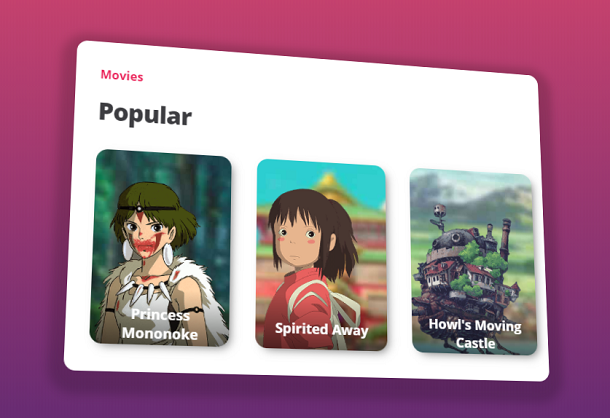
CSS3 has some properties that can achieve 3D visual effects. When these 3D features are applied to a picture, it can make the picture appear three-dimensional. This CSS3 based 3D oblique parallax picture special effect brought to you today is very good. The text caption is suspended above the picture, and proper projection is added around the picture. At the same time, it will form a 3D parallax effect with the movement of the mouse.
Advertisement
<div class="cards">
  <h3>Movies</h3>
  <h1>Popular</h1>
  <div class="card card__one">
    <div class="card__bg"></div>
    <img class="card__img" src="img/3dr_mono.png" />
    <div class="card__text">
      <p class="card__title">Princess Mononoke</p>
    </div>
  </div>
  <div class="card card__two">
    <div class="card__bg"></div>
    <img class="card__img" src="img/3dr_chihiro.png" />
    <div class="card__text">
      <p class="card__title">Spirited Away</p>
    </div>
  </div>
  <div class="card card__three">
    <div class="card__bg"></div>
    <img class="card__img" src="img/3dr_howlcastle.png" />
    <div class="card__text">
      <p class="card__title">Howl's Moving Castle</p>
    </div>
  </div>
</div>
body {
  align-items: center;
  background: #642B73;
  background: linear-gradient(to bottom, #C6426E, #642B73);
  font-family: 'Open Sans', sans;
  justify-content: center;
  -webkit-perspective: 1800px;
          perspective: 1800px;
  text-align: center;
  margin: 0 20px;
}

h1 {
  color: #3e3e42;
  font-size: 32px;
  font-weight: 800;
  letter-spacing: -1px;
  margin-bottom: 30px;
  -webkit-transform: translateZ(35px);
          transform: translateZ(35px);
}

h3 {
  color: #eb285d;
  font-size: 16px;
  margin-bottom: 6px;
  -webkit-transform: translateZ(25px);
          transform: translateZ(25px);
}
var cards = document.querySelector(".cards");
var images = document.querySelectorAll(".card__img");
var backgrounds = document.querySelectorAll(".card__bg");
var range = 40;

var calcValue = function calcValue(a, b) {return (a / b * range - range / 2).toFixed(1);}; // thanks @alice-mx

var timeout = void 0;
document.addEventListener('mousemove', function (_ref) {var x = _ref.x,y = _ref.y;
  if (timeout) {
    window.cancelAnimationFrame(timeout);
  }

  timeout = window.requestAnimationFrame(function () {
    var yValue = calcValue(y, window.innerHeight);
    var xValue = calcValue(x, window.innerWidth);
    console.log(xValue, yValue);
    cards.style.transform = "rotateX(" + yValue + "deg) rotateY(" + xValue + "deg)";

    [].forEach.call(images, function (image) {
      image.style.transform = "translateX(" + -xValue + "px) translateY(" + yValue + "px)";
    });

    [].forEach.call(backgrounds, function (background) {
      background.style.backgroundPosition = xValue * .45 + "px " + -yValue * .45 + "px";
    });
  });
}, false);
Advertisement