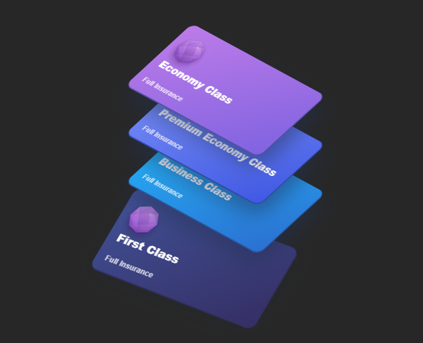
CSS3 provides a lot of properties to achieve 3D effects. We have also shared some card animations based on CSS3 and HTML5 before. This time we bring you another CSS3-based card stacking animation, which can stack several cards up and down, and give the card a glowing effect when the mouse rolls over. The stacked cards give people a 3D visual effect.
Advertisement
<div class="tariffCards">
    <div class="economy">
        <img src="img/tarcs.png" alt="Economy" height="74">
        <h3>Economy Class</h3>
        <span>Full Insurance</span>
    </div>
    <div class="premiumeconomy">
        <img src="img/tarcs.png" alt="Premium Economy" height="74">
        <h3>Premium Economy Class</h3>
        <span>Full Insurance</span>
    </div>
    <div class="business">
        <img src="img/tarcs.png" alt="Business" height="74">
        <h3>Business Class</h3>
        <span>Full Insurance</span>
    </div>
    <div class="first">
        <img src="img/tarcs.png" alt="First" height="74">
        <h3>First Class</h3>
        <span>Full Insurance</span>
    </div>
</div>
body {
  background-color: #272727;
  display: grid;
  font-family: Avenir, sans-serif;
  -ms-text-size-adjust: 100%;
  -webkit-text-size-adjust: 100%;
  -moz-osx-font-smoothing: grayscale;
  -moz-font-smoothing: antialiased;
  -webkit-font-smoothing: antialiased;
  font-smoothing: antialiased;
}

.tariffCards {
  position: absolute;
  top: 50%;
  left: 50%;
  margin: -180px 0 0 -140px;
  user-select: none;
  transform: translate3d(0, 0, 0);
  transform-style: preserve-3d;
}
.tariffCards:after {
  position: absolute;
  bottom: -27px;
  left: 5%;
  content: "";
  width: 65%;
  height: 10px;
  border-radius: 100%;
  background-image: radial-gradient(rgba(34, 50, 84, 0.04), rgba(34, 50, 84, 0));
}
.tariffCards > div {
  position: relative;
  width: 280px;
  height: 140px;
  border-radius: 12px;
  color: white;
  transform: rotateX(45deg) rotateY(-15deg) rotate(45deg);
  transition: all 0.4s ease;
  overflow: hidden;
  cursor: pointer;
}
Advertisement