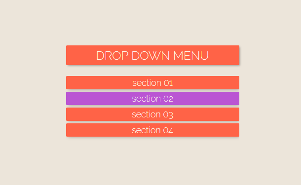
What we are going to introduce this time is also a drop-down menu, implemented based on CSS3. Its characteristic is that the main menu has a layer of shadow, so that the entire drop-down menu looks like a 3D visual effect. Isn’t it great?
Advertisement
<nav>
     <h2>Drop Down Menu</h2>
      <input id="toggle" type="checkbox" checked>
   <ul>
     <li><a href="#">Section 01</a></li>
     <li><a href="#">Section 02</a></li>
     <li><a href="#">Section 03</a></li>
     <li><a href="#">Section 04</a></li>
   </ul>
</nav>
body {
  background: #ece5da;
  font-family: 'Raleway', sans-serif;
}

nav {
  margin: auto;
  margin-top: 40px;
  position: relative;
  width: 50vw;
  min-width: 320px;
  height: 200px;
}

nav h2 {
  border-radius: 2px;
  position: relative;
  background: tomato;
  height: 40px;
  text-transform: uppercase;
  color: ivory;
  font-weight: 200;
  display: flex;
  flex: 1;
  justify-content: center;
  align-items: center;
  box-shadow: 4px 4px 20px -2px rgba(0,0,0,.35);
  transition: all .4s;
}

nav:hover h2{
  transform: translateY(-2px);
  box-shadow: 2px 2px 5px -1px rgba(0,0,0,.35);
 }
nav:hover:active h2{
  transform: translateY(10px);
  box-shadow: 0px -1px 2px 0px rgba(0,0,0,.35);
 }
Advertisement