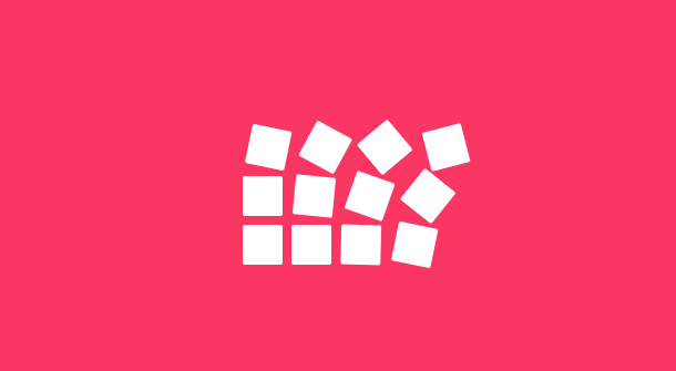
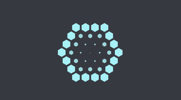
We have shared a lot of CSS3 Loading animations with different styles before. This time we bring you another hexagonal loading animation based on pure CSS3. The characteristic of this Loading animation is that there are many small hexagons combined into a big six. Hexagons, the combination of small hexagons and large hexagons is switched continuously while waiting for loading.
Advertisement
<div class="gel center-gel">
		<div class="hex-brick h1"></div>
		<div class="hex-brick h2"></div>
		<div class="hex-brick h3"></div>
	</div>
	<div class="gel c1 r1">
		<div class="hex-brick h1"></div>
		<div class="hex-brick h2"></div>
		<div class="hex-brick h3"></div>
	</div>
	<div class="gel c2 r1">
		<div class="hex-brick h1"></div>
		<div class="hex-brick h2"></div>
		<div class="hex-brick h3"></div>
	</div>
	<div class="gel c3 r1">
		<div class="hex-brick h1"></div>
		<div class="hex-brick h2"></div>
		<div class="hex-brick h3"></div>
	</div>
	<div class="gel c4 r1">
		<div class="hex-brick h1"></div>
		<div class="hex-brick h2"></div>
		<div class="hex-brick h3"></div>
	</div>
	<div class="gel c5 r1">
		<div class="hex-brick h1"></div>
		<div class="hex-brick h2"></div>
		<div class="hex-brick h3"></div>
	</div>
	<div class="gel c6 r1">
		<div class="hex-brick h1"></div>
		<div class="hex-brick h2"></div>
		<div class="hex-brick h3"></div>
	</div>

	<div class="gel c7 r2">
		<div class="hex-brick h1"></div>
		<div class="hex-brick h2"></div>
		<div class="hex-brick h3"></div>
	</div>
.socket{
	width: 200px;
	height: 200px;
	position: absolute;
	left: 50%;
	margin-left: -100px;
	top: 50%;
	margin-top: -100px;
}

.hex-brick{
  background: #ABF8FF;
  width: 30px;
  height: 17px;
  position: absolute;
  top: 5px;
animation-name: fade;
	animation-duration: 2s;
	animation-iteration-count: infinite;
	-webkit-animation-name: fade;
	-webkit-animation-duration: 2s;
	-webkit-animation-iteration-count: infinite;
}

.h2{
	transform: rotate(60deg);
	-webkit-transform: rotate(60deg);
}

.h3{
	transform: rotate(-60deg);
	-webkit-transform: rotate(-60deg);
}

.gel{
	height: 30px;
	width: 30px;
	transition: all .3s;
	-webkit-transition: all .3s;
	position: absolute;
top: 50%;
left: 50%;
}
Advertisement