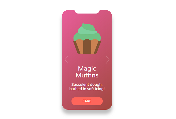
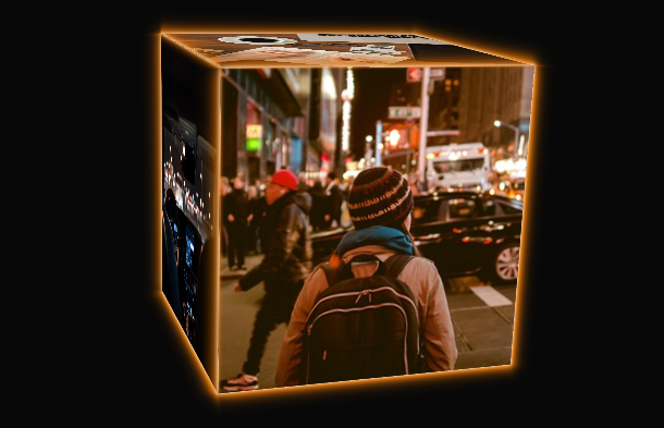
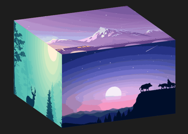
Before CSS3, we could only implement 2D plane animation on web pages, but with the popularity of CSS3 technology, we can easily implement a 3D cube on web pages. What I bring to you today is a 3D cube box based on jQuery and CSS3. We can browse every face of the box by dragging and dropping the mouse. In addition, the face of the 3D box can be customized with a cover image. Choose different pictures, and you can customize the size of the box.
Advertisement
<div id="app" v-cloak>
		<div class="picbtn">
			<p>
				On
				<input type="file" value="On" accept="image/*" @change="uploadImg($event,1)">

				Under
				<input type="file" value="Under" accept="image/*" @change="uploadImg($event,2)">
			</p>
			<p>
				Left
				<input type="file" value="Left" accept="image/*" @change="uploadImg($event,3)">

				Right
				<input type="file" value="Right" accept="image/*" @change="uploadImg($event,4)">
			</p>
			<p>
				Before
				<input type="file" value="Before" accept="image/*" @change="uploadImg($event,5)">

				Rear
				<input type="file" value="Rear" accept="image/*" @change="uploadImg($event,6)">
			</p>
			Long<input type="number" id="length" value="" v-model="size.x" >
			Width<input type="number" id="width" value="" v-model="size.y">
			High<input type="number" id="height" value="" v-model="size.z">
		</div>

		<div class="box" :style="{width:size.x+'px',height:size.z+'px'}">
			<div id="top" :style="styleTop"></div>
			<div id="bottom" :style="styleBottom"></div>
			<div id="left" :style="styleLeft"></div>
			<div id="right" :style="styleRight"></div>
			<div id="pre" :style="stylePre"></div>
			<div id="back" :style="styleBack"></div>
		</div>
	</div>
body {
		 background-color: #1D1D1D;
		 color:#fff;
		}
	.box {
		height: 400px;
		width: 400px;
		margin: 100px auto;
		position: relative;
		transform: rotateX(0deg) rotateY(0deg);
		transform-style: preserve-3d;
		cursor: move;
	}

	.box div {
		position: absolute;
		left: 0;
		right: 0;
		background-size: cover;
		background-position: center;
	}
	.picbtn{
		margin:  0 auto;
		text-align: center;
	}
	body,input{font-family:sta cartman}
let x = '400', y = '400', z = '250';
	let vm = new Vue({
		el:'#app',
		data:{
			size:{
				x:x,
				y:y,
				z:z
			},
			styleLeft:{
				backgroundImage: `url(1.png)`,
				transform: '',
				width:'',
				height:''
			},
			styleRight:{
				backgroundImage: `url(2.png)`,
				transform: ``,
				width:'',
				height:''
			},
			styleTop:{
				backgroundImage: `url(3.png)`,
				transform: ``,
				width:'',
				height:''
			},
			styleBottom:{
				backgroundImage: `url(4.png)`,
				transform: ``,
				width:'',
				height:''

			},
			stylePre:{
				backgroundImage: `url(5.png)`,
				transform: ``,
				width:'',
				height:''
			},
			styleBack:{
				backgroundImage: `url(6.png)`,
				transform: ``,
				width:'',
				height:''

			}

		},
Advertisement