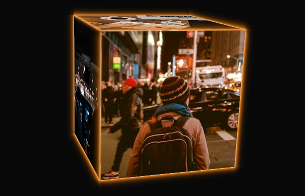
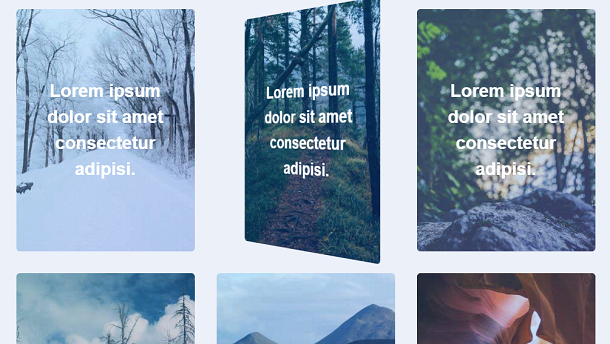
Many modern websites now like to use a card style, that is, the title, content and theme pictures of the article are made into cards on the home page. Today’s card animation is based on CSS3. The elements in the card can be any HTML element. What’s more special here is that a 3D button is displayed below the text. At the same time, when we roll the mouse over the card, the card will present a 3D flip animation.
Advertisement
<div class="back">
      <div>
        <p>Consectetur Adipisicing Elit. Possimus, Praesentium?</p>
        <p>Provident Consectetur Natus Voluptatem Quis Tenetur Sed Beatae Eius Sint.</p>
        <button class="button">Click Here</button>
      </div>
    </div></a><a class="card" href="#!">
    <div class="front" style="background-image: url(img/560.jpg);">
      <p>Lorem Ipsum Dolor Sit Amet Consectetur Adipisi.</p>
    </div>
    <div class="back">
      <div>
        <p>Consectetur Adipisicing Elit. Possimus, Praesentium?</p>
        <p>Provident Consectetur Natus Voluptatem Quis Tenetur Sed Beatae Eius Sint.</p>
        <button class="button">Click Here</button>
      </div>
    </div></a><a class="card" href="#!">
    <div class="front" style="background-image: url(img/567.jpg);">
      <p>Lorem Ipsum Dolor Sit Amet Consectetur Adipisi.</p>
    </div>
*, *:before, *:after {
  box-sizing: border-box;
}

html {
  font-size: 18px;
  line-height: 1.5;
  font-weight: 300;
  color: #333;
  font-family: "Nunito Sans", sans-serif;
}

body {
  margin: 0;
  padding: 0;
  height: 100vh;
  background-color: #ecf0f9;
  background-attachment: fixed;
}

.content {
  display: flex;
  margin: 0 auto;
  justify-content: center;
  align-items: center;
  flex-wrap: wrap;
  max-width: 1000px;
}

.heading {
  width: 100%;
  margin-left: 1rem;
  font-weight: 900;
  font-size: 1.618rem;
  text-transform: uppercase;
  letter-spacing: .1ch;
  line-height: 1;
  padding-bottom: .5em;
  margin-bottom: 1rem;
  position: relative;
}
Advertisement