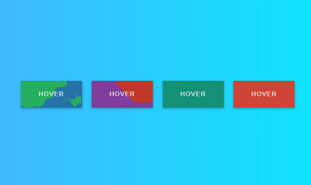
Today I will share with you a very distinctive CSS3 animation button. Many of the buttons shared before are 3D visual effects realized through CSS3 features, such as this super cool CSS3 retro style and font 3D button. This button is different. It mainly renders an ink-and-wash background animation after the mouse moves over the button. Although it is a flat style, it is relatively simple and practical, and it also has a flat effect.
Advertisement
<svg width="0" height="0">
	<filter id="filter">
		<feTurbulence type="fractalNoise" baseFrequency=".01" numOctaves="6" />
		<feDisplacementMap in="SourceGraphic" scale="100" />
	</filter>
</svg>

<div class="wrapper">
  <div class="button _1"> <span>hover</span>
    <div class="back"></div>
  </div>
  <div class="button _2"> <span>hover</span>
    <div class="back"></div>
  </div>
  <div class="button _3"> <span>hover</span>
    <div class="back"></div>
  </div>
  <div class="button _4"> <span>hover</span>
    <div class="back"></div>
  </div>
</div>
:root {
  --height: 100px;
  --width: 200px;
}

* {
  margin: 0;
  padding: 0;
  box-sizing: border-box;
}

body {
  width: 100%;
  height: 100vh;
  background-image: linear-gradient(to right, #4facfe 0%, #00f2fe 100%);
  font-family: sans-serif;
}

.wrapper {
  width: calc(4 * var(--width));
  height: calc(4 * var(--height));
  display: flex;
  justify-content: center;
  align-items: center;
}

.button {
  position: relative;
  width: calc(0.8 * var(--width));
  height: calc(0.7 * var(--height));
  display: flex;
  justify-content: center;
  align-items: center;
  cursor: pointer;
  overflow: hidden;
  margin: 0 0.8rem;
  box-shadow: 0 2px 5px rgba(0, 0, 0, 0.2), 0 3px 8px rgba(0, 0, 0, 0.1);
  transition: all 0.3s cubic-bezier(0, 0.22, 0.3, 1);
}
Advertisement