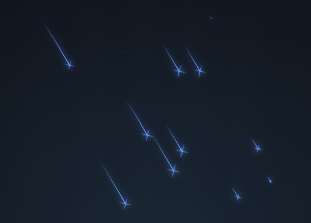
Today I will share with you a very interesting pure CSS3 animation, which simulates the scene when the meteor shower falls. This animation takes advantage of some of the new features of CSS3, including the inclination of straight lines, color gradients, etc. It not only draws many meteor graphics, but also makes these pops randomly generated and slide across the sky. The effect is very good.
Advertisement
<div class="night">
  <div class="shooting_star"></div>
  <div class="shooting_star"></div>
  <div class="shooting_star"></div>
  <div class="shooting_star"></div>
  <div class="shooting_star"></div>
  <div class="shooting_star"></div>
  <div class="shooting_star"></div>
  <div class="shooting_star"></div>
  <div class="shooting_star"></div>
  <div class="shooting_star"></div>
  <div class="shooting_star"></div>
  <div class="shooting_star"></div>
  <div class="shooting_star"></div>
  <div class="shooting_star"></div>
  <div class="shooting_star"></div>
  <div class="shooting_star"></div>
  <div class="shooting_star"></div>
  <div class="shooting_star"></div>
  <div class="shooting_star"></div>
  <div class="shooting_star"></div>
</div>
body {
  background: radial-gradient(ellipse at bottom, #1b2735 0%, #090a0f 100%);
  height: 100vh;
  overflow: hidden;
  font-family: 'Anton', sans-serif;
  justify-content: center;
  align-items: center;
}

.night {
  position: relative;
  width: 100%;
  height: 100%;
  -webkit-transform: rotateZ(45deg);
          transform: rotateZ(45deg);
  -webkit-animation: sky 200000ms linear infinite;
          animation: sky 200000ms linear infinite;
}

.shooting_star {
  position: absolute;
  left: 50%;
  top: 50%;
  height: 2px;
  background: linear-gradient(-45deg, #5f91ff, rgba(0, 0, 255, 0));
  border-radius: 999px;
  -webkit-filter: drop-shadow(0 0 6px #699bff);
          filter: drop-shadow(0 0 6px #699bff);
  -webkit-animation: tail 3000ms ease-in-out infinite, shooting 3000ms ease-in-out infinite;
          animation: tail 3000ms ease-in-out infinite, shooting 3000ms ease-in-out infinite;
}
.shooting_star::before, .shooting_star::after {
  content: '';
  position: absolute;
  top: calc(50% - 1px);
  right: 0;
  height: 2px;
  background: linear-gradient(-45deg, rgba(0, 0, 255, 0), #5f91ff, rgba(0, 0, 255, 0));
  -webkit-transform: translateX(50%) rotateZ(45deg);
          transform: translateX(50%) rotateZ(45deg);
  border-radius: 100%;
  -webkit-animation: shining 3000ms ease-in-out infinite;
          animation: shining 3000ms ease-in-out infinite;
}
Advertisement