This is a cartoon text animation that uses CSS3 animation features and Google font library. First, Google’s font library is introduced, so that we can use the "Luckiest Guy" font in css, which embodies the cartoon style. Then use CSS3 to display the text according to the arc path, and then use the animation feature of CSS3 to make the text display using jump-in and fade-in methods to achieve a more lovely animation effect.
Advertisement
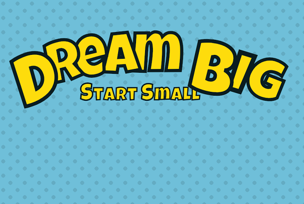
<div class="content">
	<h1>
		<span class="capital">D</span>
		<span>r</span>
		<span>e</span>
		<span>a</span>
		<span>m</span>
		<span class="capital">B</span>
		<span>i</span>
		<span>g</span>
	</h1>
	<h2>
		<span class="capital">S</span>
		<span>t</span>
		<span>a</span>
		<span>r</span>
		<span>t</span>
		<span class="capital">s</span>
		<span>m</span>
		<span>a</span>
		<span>l</span>
		<span>l</span>
	</h2>
</div>
:root {
  --stroke: #0A1C20;
  --text: #FEDC0C;
  --bg: #6FBFD9;
  --duration: 550ms;
  --easing: cubic-bezier(0.68, -0.55, 0.265, 1.55);
}

html, body {
  width: 100%;
  height: 100%;
  overflow: hidden;
}

body {
  background-image: radial-gradient(rgba(0, 0, 0, 0.1) 20%, transparent 20%), radial-gradient(rgba(0, 0, 0, 0.1) 20%, transparent 20%);
  background-color: var(--bg);
  background-position: 0 0, 20px 20px;
  background-size: 40px 40px;
}

.content {
  position: absolute;
  top: 10%;
  left: 50%;
  -webkit-transform: translate(-90px, -50%);
          transform: translate(-90px, -50%);
}

h1,
h2 {
  position: relative;
  margin: 0;
  color: var(--text);
  -webkit-text-stroke-color: var(--stroke);
  text-align: center;
  font-family: 'Luckiest Guy', cursive;
  line-height: 1;
  white-space: nowrap;
  -webkit-text-stroke-width: 0px;
}
var spans = document.getElementsByTagName('span')

function doSetTimeout(i) {
  setTimeout(function(){
		spans[i].classList += ' animate-in'
	}, 120 * i)
}

window.addEventListener('load', function() {
    for (var i = 0; i < spans.length; i++) {
		doSetTimeout(i)
	}
})
Advertisement