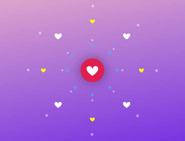
In modern web pages, we can often find the "Like" button on some article, video, and picture pages, and click the button to indicate whether we like or dislike the content. Most "Like" buttons are plain text buttons or image buttons. If you want them to have special animation effects, then we need to use CSS3 or JavaScript. This article brings you a Like button with a heart hash animation, mainly using the two technologies of SVG and CSS3. When you light up the Like button, multiple colorful hearts will radiate around the button.
Advertisement
<div class="dot dot-1"></div>
<div class="dot dot-2"></div>
<div class="dot dot-3"></div>
<div class="dot dot-4"></div>
<div class="dot dot-5"></div>
<div class="dot dot-6"></div>
<div class="dot dot-7"></div>
<div class="dot dot-8"></div>

<svg height="40" width="40" viewBox="0 0 320 320" class="h h-1"><path class="path" d="M 160 145 c 15 -90 170 -20 0 90 m 0 -90 c -15 -90 -170 -20 0 90"></svg>
<svg height="40" width="40" viewBox="0 0 320 320" class="h h-2"><path class="path" d="M 160 145 c 15 -90 170 -20 0 90 m 0 -90 c -15 -90 -170 -20 0 90"></svg>
<svg height="40" width="40" viewBox="0 0 320 320" class="h h-3"><path class="path" d="M 160 145 c 15 -90 170 -20 0 90 m 0 -90 c -15 -90 -170 -20 0 90"></svg>
<svg height="40" width="40" viewBox="0 0 320 320" class="h h-4"><path class="path" d="M 160 145 c 15 -90 170 -20 0 90 m 0 -90 c -15 -90 -170 -20 0 90"></svg>

<svg height="40" width="40" viewBox="0 0 320 320" class="h h-5"><path class="path" d="M 160 145 c 15 -90 170 -20 0 90 m 0 -90 c -15 -90 -170 -20 0 90"></svg>
<svg height="40" width="40" viewBox="0 0 320 320" class="h h-6"><path class="path" d="M 160 145 c 15 -90 170 -20 0 90 m 0 -90 c -15 -90 -170 -20 0 90"></svg>
<svg height="40" width="40" viewBox="0 0 320 320" class="h h-7"><path class="path" d="M 160 145 c 15 -90 170 -20 0 90 m 0 -90 c -15 -90 -170 -20 0 90"></svg>
<svg height="40" width="40" viewBox="0 0 320 320" class="h h-8"><path class="path" d="M 160 145 c 15 -90 170 -20 0 90 m 0 -90 c -15 -90 -170 -20 0 90"></svg>

<svg height="110" width="110" viewBox="0 0 320 320" class="fly fly-1"><path class="path" d="M 160 145 c 15 -90 170 -20 0 90 m 0 -90 c -15 -90 -170 -20 0 90"></svg>
<svg height="110" width="110" viewBox="0 0 320 320" class="fly fly-2"><path class="path" d="M 160 145 c 15 -90 170 -20 0 90 m 0 -90 c -15 -90 -170 -20 0 90"></svg>
* {
  margin: 0;
  padding: 0;
  box-sizing: border-box;
  position: relative;
}

svg.like {
  position: fixed;
  z-index: 10;
  top: calc(50vh - 160px);
  left: calc(50vw - 160px);
  border-radius: 100%;
  -webkit-transform: scale(0.3);
          transform: scale(0.3);
  -webkit-transform-origin: 50% 50%;
          transform-origin: 50% 50%;
  box-shadow: 0 0 250px rgba(0, 0, 0, 0.4);
  background: #212121;
  cursor: pointer;
}

svg.fly {
  position: fixed;
  top: calc(50vh - 55px);
  left: calc(50vw - 55px);
  fill: #18FFFF;
}

svg.h {
  position: fixed;
  z-index: 8;
  top: calc(50vh - 20px);
  left: calc(50vw - 20px);
  fill: #fbff00;
}
svg.h.h-5, svg.h.h-6, svg.h.h-7, svg.h.h-8 {
  fill: #00ffb8;
}
document.body.onkeypress = function(){document.body.classList.toggle('liked')}
Advertisement