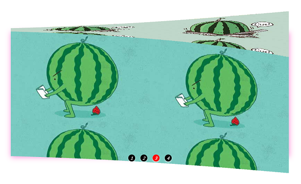
Today we share with you a 3D wave effect image switching animation based on JavaScript and CSS3. When the image is switched, it is like a wave flipping, showing a 3D stereoscopic switching animation effect.
Advertisement
* {
		margin: 0;
		padding: 0;
	}
	li {
		list-style: none;
	}
	.solid {
		width: 800px;
		height: 360px;
		margin: 90px auto 0;
		box-shadow: 1px 7px 25px #fd8fd9;
	}
	.solid ul {
		height: 100%;
	}
	.solid ul li {
		position: relative;
		float: left;
		box-sizing: border-box;
		transform-style: preserve-3d;
		transform: translateZ(-180px);
	}
	.solid ul li div {
		position: absolute;
		width: 100%;
		height: 100%;
	}
	.solid ul li div:nth-child(1) {
		top: -360px;
		background: url('./img/02.jpg');
		transform-origin: bottom;
		transform: translateZ(180px) rotateX(90deg);
	}
	.solid ul li div:nth-child(2) {
		top: 360px;
		background: url('./img/01.jpg');
		transform-origin: top;
		transform: translateZ(180px) rotateX(-90deg);
	}
createDom();
function createDom() {
    var num = 100, uHTML = '', pHTML = '', tHTML = '';
    var allWidth = parseInt(getComputedStyle(solid, null).width);
    var width = allWidth / num;
    for (var i = 0; i < num; i++) {
        uHTML += '<li><div></div><div></div><div></div><div></div></li>';
        pHTML += '.solid ul li:nth-child(' + (i + 1) + ') div{background-position-x: ' + (-i*width) + 'px;}';
        tHTML += '.solid ul li:nth-child(' + (i + 1) + '){transition: 0.8s ' + (0.3 * i / num) + 's}';
    }
    oUl.innerHTML = uHTML;
    css.innerHTML += pHTML + tHTML  + '.solid ul li, .solid ul li div{width:' + width + 'px;height:100%}';
    bindEvent();
    play();
}

function bindEvent() {
    for (var i = 0; i < btn.length; i++) {
        btn[i].index = i;
        btn[i].onclick = function () {
            n = this.index;
            for (var i = 0; i < btn.length; i++) {
                btn[i].className = '';
            }
            this.className = 'on';
            css.innerHTML += '.solid ul li{transform: translateZ(-180px) rotateX(' + (n * 90) + 'deg);}';
        }
    };
    solid.onmouseenter = function () {
        clearInterval(timer);
    };
    solid.onmouseleave = function () {
        play();
    };
}
Advertisement