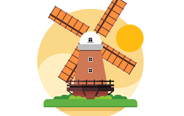
This time we are also introducing a windmill rotating animation based on CSS3, but the elements of this windmill are richer, more like in a beautiful village, a windmill is constantly rotating under the rendering of sunset.
Advertisement
<div class="window">
  <div class="windmill">
    <div class="pillar"></div>
    <div class="dome">
      <div class="dome-window"></div>
    </div>
    <div class="windmill-window"></div>
    <div class="blades">
      <div class="blade blade-1"></div>
      <div class="blade blade-2"></div>
      <div class="blade blade-3"></div>
      <div class="blade blade-4"></div>
    </div>
    <div class="ramp">
      <div class="grill"></div>
      <div class="hook hook-1"></div>
      <div class="hook hook-2"></div>
      <div class="hook hook-3"></div>
      <div class="hook hook-4"></div>
    </div>
  </div>
  <div class="sun"></div>
  <div class="land"></div>
  <div class="grass grass-1"></div>
  <div class="grass grass-2"></div>
</div>
body {
  width: 100vw;
  height: 100vh;
  margin: 0;
}

* {
  position: absolute;
  box-sizing: border-box;
}
*::before, *::after {
  content: '';
  position: inherit;
  box-sizing: inherit;
}

.window {
  width: 540px;
  height: 540px;
  left: 50%;
  top: 50%;
  -webkit-transform-origin: 50% 50%;
          transform-origin: 50% 50%;
  -webkit-transform: translate(-50%, -50%) scale(1);
          transform: translate(-50%, -50%) scale(1);
  border-radius: 50%;
  background: radial-gradient(farthest-side at 135px 340px, var(--sky-color-2) 135px, transparent 135px), radial-gradient(farthest-side at 405px 300px, var(--sky-color-1) 140px, transparent 135px), linear-gradient(to bottom, var(--sky-color-1) 320px, var(--sky-color-2) 320px);
  -webkit-animation: window-move var(--window-move-time) ease-in-out infinite alternate;
          animation: window-move var(--window-move-time) ease-in-out infinite alternate;
}
.window::before {
  bottom: 0;
  left: 0;
  top: 0;
  right: 0;
  background: linear-gradient(to bottom, transparent 490px, var(--sky-color-3) 490px, var(--sky-color-3) 510px, var(--sky-color-1) 510px);
  border-radius: 50%;
  -webkit-animation: window-bottom-move var(--window-move-time) ease-in-out infinite alternate;
          animation: window-bottom-move var(--window-move-time) ease-in-out infinite alternate;
}
Advertisement