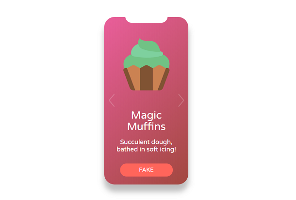
We have shared a lot of card animations implemented by CSS3 before. This time we are introducing a card content flipping and switching animation based on CSS3 and SVG. The content in the card can be any HTML code, such as pictures and text. Click on the left and right After switching the button, the content in the card can be flipped and switched, and the effect is very good.
Advertisement
<div class="screen">
  <div class="background"></div>
  <div class="stage">
    <div class="page">
      <svg class="cupcake"><use xlink:href="#cupcake"></use></svg>
      <h1>Creamy<br />Cupcakes</h1>
      <p>Who wouldn't want more of these?</p>
      <div class="button_fake">Fake</div>
    </div>
    <div class="page">
      <svg class="cupcake"><use xlink:href="#food"></use></svg>
      <h1>Divine Doughnuts</h1>
      <p>Delicious icing and that soft pastry!</p>
      <div class="button_fake">Fake</div>
    </div>
    <div class="page">
      <svg class="cupcake"><use xlink:href="#dessert"></use></svg>
      <h1>Precious Pancakes</h1>
      <p>Dripping with butter and maple syrup...</p>
      <div class="button_fake">Fake</div>
    </div>
    <div class="page">
      <svg class="cupcake"><use xlink:href="#muffin"></use></svg>
      <h1>Magic Muffins</h1>
      <p>Succulent dough, bathed in soft icing!</p>
      <div class="button_fake">Fake</div>
    </div>
  </div>
  <button class="button button_prev">
    <svg class="arrow"><use xlink:href="#left-arrow"></use></svg>
  </button>
  <button class="button button_next">
    <svg class="arrow"><use xlink:href="#right-arrow"></use></svg>
  </button>
</div>
body {
  align-items: center;
  background: #fff;
  font-family: 'Varela Round', sans;
  justify-content: center;
}

.screen {
  border-radius: 5vh;
  box-shadow: 0px 20px 25px 1px rgba(0, 0, 0, 0.25);
  height: 80vh;
  overflow: hidden;
  position: relative;
  width: 40vh;
  margin: 50px auto;
}
.screen::before {
  background: #fff;
  border-bottom-left-radius: 3vh;
  border-bottom-right-radius: 3vh;
  content: '';
  height: 3vh;
  left: -25%;
  margin-left: 50%;
  position: absolute;
  top: -1px;
  -webkit-transform: rotateX(-10deg);
          transform: rotateX(-10deg);
  width: 50%;
  z-index: 1;
}
var stage = document.querySelector('.stage');
var background = document.querySelector('.background');

var rotation = 0;

document.querySelector('.button_prev').
addEventListener('click', function () {return applyStyles(rotation += 90);});

document.querySelector('.button_next').
addEventListener('click', function () {return applyStyles(rotation -= 90);});

function applyStyles() {
  background.style.filter = 'hue-rotate(' + rotation + 'deg)';
  stage.style.transform = 'rotateZ(' + rotation + 'deg)';
}
Advertisement