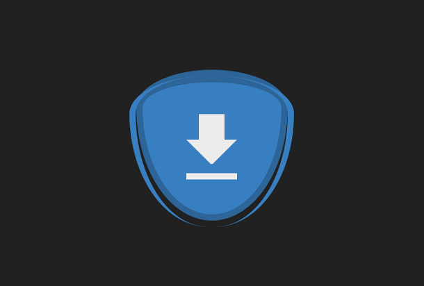
This is a super creative and very cute CSS3 download button with a CSS3 drawn download icon and a download animation that loops when the mouse hovers over the button. This CSS3 download button changes shape when the mouse slides over and off and is very creative in appearance.
Advertisement
<div class="container">
  <div class="arrow">
    <div class="arrow-top"></div>
    <div class="arrow-down"></div>
  </div>
  <div class="line"></div>
</div>
body {
  height: 100vh;
  justify-content: center;
  align-items: center;
  background-color: #212121;
}

.container {
  width: 50vmin;
  height: 50vmin;
  display: flex;
  flex-direction: column;
  justify-content: center;
  align-items: center;
  background-color: #387fc1;
  border-radius: 50% 50% 50% 50% / 25% 25% 75% 75%;
  border-color: #2d6599;
  border-style: solid;
  border-top-width: 4.1666666667vmin;
  border-right-width: 2.0833333333vmin;
  border-bottom-width: 2.0833333333vmin;
  border-left-width: 2.0833333333vmin;
  transition: border-width 0.4s cubic-bezier(1, -0.37, 0.21, 1.47), border-radius 0.4s cubic-bezier(1, -0.37, 0.21, 1.47);
  position: relative;
  margin:30px auto;
}
.container::before, .container::after {
  content: '';
  position: absolute;
  width: 50vmin;
  height: 50vmin;
  bottom: -4.1666666667vmin;
  border-radius: 50% 50% 50% 50% / 25% 25% 75% 75%;
  transition: all 0.4s cubic-bezier(1, -0.37, 0.21, 1.47);
}
.container::before {
  left: -4.1666666667vmin;
  border-left: 2.0833333333vmin solid #387fc1;
}
.container::after {
  right: -4.1666666667vmin;
  border-right: 2.0833333333vmin solid #387fc1;
}
Advertisement


