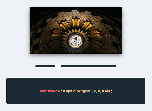
In modern web pages, the shadow effect is one of the most widely used effects, and it is also the most convenient to implement, just one line of CSS3 code. However, it may be difficult for us to control the value of the CSS3 shadow property, and you may not know exactly how much the shadow value needs to be set to achieve the effect you want. Today this app can help you solve this problem. You can dynamically change the shadow value by sliding the slider and preview the shadow effect in real time.
Advertisement
<div class="container">

  <div id="info">
    <h1>CSS3 Adjustable and real-time preview shadow effect</h1>
  </div>

  <div id="box"><img src="css/image.jpg" alt="demo" /></div>

  <div class="slidecontainer">
    <input type="range" min="1" max="100" value="1" class="slider" id="myRange">
    <p>box-shadow <span style="color: #fff">:</span> <span id="shadow-info">0 1px 2px rgba(0, 0, 0, 0.50), 0 1px 3px rgba(0, 0, 0, 0.46)</span><span style="color: #fff"> ;</span></p>
  </div>

</div>
.slider {
  -webkit-appearance: none;
  max-width: 350px;
  width: 100%;
  height: 10px;
  border-radius: 5px;
  background: #1B2B33;
  outline: none;
  margin-top: 50px;
  margin-bottom: 30px
}

.slider::-webkit-slider-thumb {
  -webkit-appearance: none;
  appearance: none;
  width: 25px;
  height: 25px;
  border-radius: 50%;
  background: #fff;
  box-shadow: 0 1px 1px rgba(0,0,0,.5);
  cursor: pointer;
}

.slider::-moz-range-thumb {
  width: 25px;
  height: 25px;
  border-radius: 50%;
  background: #fff;
  box-shadow: 0 1px 3px rgba(0,0,0,.1);
  cursor: pointer;
}
body{
  background: #EEF2F6;
  border: none;
  padding: 0 20px;
  font-size: 15px;
  color: #1B2B33;
  font-family: sans-serif;
  -webkit-font-smoothing: antialiased;
  -moz-osx-font-smoothing: grayscale;
}
var slider = document.getElementById("myRange");
var box = document.getElementById("box");
var shadowInfo = document.getElementById("shadow-info");

slider.oninput = function() {

  var v = this.value;

  var largeShadow = `0 ${(v/3).toFixed(0)}px ${v}px rgba(0, 0, 0, ${(.5 - (v/ 500)).toFixed(2)})`;
  var smallShadow = `0 ${(v/1.5).toFixed(0)}px ${(v*1.5).toFixed(0)}px rgba(0, 0, 0, ${(.5 - (v/ 50)).toFixed(2)})`;

  var shadow = largeShadow + ", " + smallShadow;

  if( (.5 - (v/ 50)).toFixed(2) <= 0 ){
    shadow = largeShadow;
  }

  box.style.boxShadow = shadow;
  shadowInfo.innerText = shadow;

}
Advertisement