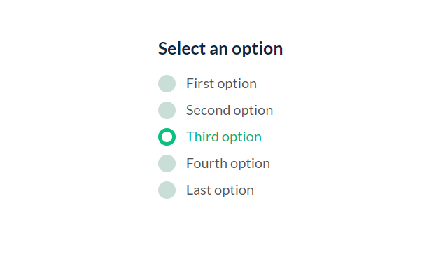
Radiobox is a commonly used element in web forms. Sometimes in order to unify the style of the web page and make the page more coordinated, we usually need to rewrite the default style of the browser's radio box. What we are going to share today is a personalized custom style Radiobox radio box based on CSS3. It not only has a flat style appearance, but also has an animation effect when the selected item is switched.
Advertisement
<div class="swappy-radios" role="radiogroup" aria-labelledby="swappy-radios-label">
  <h3 id="swappy-radios-label">Select an option</h3>
  <label>
    <input type="radio" name="options" checked /><span class="radio"></span>
    <span>First option</span>
  </label>
  <label>
    <input type="radio" name="options" /><span class="radio"></span>
    <span>Second option</span>
  </label>
  <label>
    <input type="radio" name="options" /><span class="radio"></span>
    <span>Third option</span>
  </label>
  <label>
    <input type="radio" name="options" /><span class="radio"></span>
    <span>Fourth option</span>
  </label>
  <label>
    <input type="radio" name="options" /><span class="radio"></span>
    <span>Last option</span>
  </label>
</div>
body {
  min-height: 100vh;
  color: #0f273d;
  font-family: 'Lato', sans-serif;
}

h3 {
  font-size: 2.5rem;
  font-weight: bold;
}

.swappy-radios {
  width: 200px;
  margin: 100px auto;
}

.swappy-radios label {
  display: block;
  position: relative;
  padding-left: 4rem;
  margin-bottom: 1.5rem;
  cursor: pointer;
  font-size: 2rem;
  -webkit-user-select: none;
     -moz-user-select: none;
      -ms-user-select: none;
          user-select: none;
  color: #555;
}
.swappy-radios label:hover input ~ .radio {
  opacity: 0.8;
}
.swappy-radios input {
  position: absolute;
  opacity: 0;
  cursor: pointer;
  height: 0;
  width: 0;
}
.swappy-radios input:checked ~ span {
  color: #0bae72;
  transition: color .5s;
}
function appendStyles(css) {
  const head = document.head;
  const style = document.createElement('style');
  style.type = 'text/css';
  style.id = 'swappy-radio-styles';
  style.appendChild(document.createTextNode(css));
  head.appendChild(style);
}
function removeStyles() {
  const node = document.getElementById('swappy-radio-styles');
  if (node && node.parentNode) {
    node.parentNode.removeChild(node);
  }
}
function range(start, end, dirDown) {
  let extra = 1;
  if (dirDown) {
      extra = 0;
  }
  return [...Array(end - start).keys()].map(v => start + v + extra);
}
function temporarilyDisable() {
    radios.forEach((item) => {
      item.setAttribute('disabled', true);
      setTimeout(() => {
        item.removeAttribute('disabled');
      }, timeout * 1000);
    });
}
Advertisement