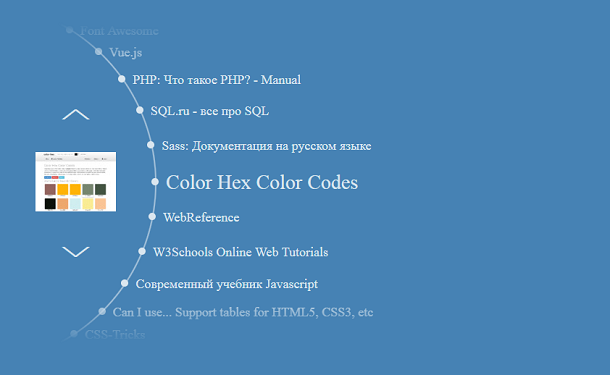
Today I bring you a very creative CSS3 menu navigation plugin. It is different from the horizontal or vertical menus we usually see. Its menu items are distributed along an arc curve, and there are two up and down switches. When switching to a certain menu item, the menu item will move along the curve to the current window, and the corresponding small icon will be displayed at the same time. More importantly, the switching of the menu item is cyclic, so it is very convenient to use.
Advertisement
<div class="item">
            <a href=""
               data-img="img/1.jpg"
               target="_blank"
               rel="noopener">
               Sass: Документация на русском языке
            </a>
          </div>
          <div class="item">
            <a href=""
               data-img="img/2.jpg"
               target="_blank"
               rel="noopener">
               Color Hex Color Codes
            </a>
          </div>
          <div class="item">
            <a href=""
               data-img="img/3.jpg"
               target="_blank"
               rel="noopener">
               WebReference
            </a>
          </div>
          <div class="item">
            <a href=""
               data-img="img/4.jpg"
               target="_blank"
               rel="noopener">
               W3Schools Online Web Tutorials
            </a>
          </div>
a:hover,
a {
  color: inherit;
  text-decoration: inherit;
}

.c-menu {
  position: relative;
  height: 440px;
  width: 800px;
  overflow: hidden;
  margin-left: 50px;
  margin-top: 50px;
}

.top, .bottom {
  position: absolute;
  left: 0;
  width: 100%;
  height: 50px;
  background: transparent;
}

.top {
  top: 0;
  background: linear-gradient(to bottom, steelblue 0%, rgba(70, 130, 180, 0) 100%);
}

.bottom {
  bottom: 0;
  background: linear-gradient(to bottom, rgba(70, 130, 180, 0) 0%, steelblue 100%);
}

.img-box, .hide {
  position: absolute;
  left: 7px;
  top: 177px;
  width: 111px;
  height: 82px;
  opacity: 1;
  transition: opacity, 2s;
}
const srart_pos = 90.75;
const item_count = 13;
const s = 0.52 * Math.PI / 180;

var pos = [];
var elem = document.getElementsByClassName('item');


function allocationItems() {
  var i;
  var pp = elem[6].getElementsByTagName('a')[0].getAttribute('data-img');
  document.getElementById("pic").style.backgroundImage = "url('"+pp+"')";
  document.getElementById("pic").className = "img-box";
  pos[0] = srart_pos;
  for (i = 1; i < item_count; i++) {
    pos[i] = pos[i - 1] - 0.2;
    last_pos=pos[i];
  }
  for (i = 0; i < item_count+1; i++) {
    elem[i].style.left = 240 + 250 * Math.sin(pos[i]) + 'px';
    elem[i].style.top = 240 + 250 * Math.cos(pos[i]) + 'px';
  }
}

allocationItems();
Advertisement