Today I will share with you a very good CSS3 3D style picture stacking switching animation. When the mouse moves over the picture, the picture will be rotated to the current window to highlight, and other pictures will be hidden behind it, presenting a 3D stereoscopic visual effect . More importantly, the picture switching is very smooth when the mouse is over, and the user experience is relatively good.
Advertisement
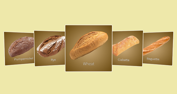
<div class="gallery-container">
	<div class="gallery">
		<div class="frame">
			<img class="image" src="img/pumpernickel.png">
			<div class="info">Pumpernickel</div>
		</div>
		<div class="frame">
			<img class="image" src="img/rye.png">
			<div class="info">Rye</div>
		</div>
		<div class="frame">
			<img class="image" src="img/wheat.png">
			<div class="info">Wheat</div>
		</div>
		<div class="frame">
			<img class="image" src="img/ciabatta.png">
			<div class="info">Ciabatta</div>
		</div>
		<div class="frame">
			<img class="image" src="img/baguette.png">
			<div class="info">Baguette</div>
		</div>
	</div>
</div>
.gallery-container {
  position: relative;
  height: 100vh;
  width: 100vw;
  overflow: hidden;
}

.gallery {
  position: absolute;
  top: 50%;
  display: flex;
  align-items: center;
  justify-content: center;
  width: 100vw;
  height: 200px;
  -webkit-perspective: 800px;
          perspective: 800px;
  -webkit-transform-style: preserve-3d;
          transform-style: preserve-3d;
  -webkit-transform-origin: center center;
          transform-origin: center center;
  -webkit-transform: translateY(-50%);
          transform: translateY(-50%);
}

.frame {
  display: flex;
  flex-flow: column;
  align-items: center;
  justify-content: center;
  border: 2px solid white;
  border-radius: 4px;
  position: relative;
  height: 100%;
  width: 200px;
  background: white;
  -webkit-transform-style: preserve-3d;
          transform-style: preserve-3d;
  -webkit-transform-origin: center center;
          transform-origin: center center;
  cursor: pointer;
  overflow: hidden;
  background: radial-gradient(#cfaf7f, #6a4a0f);
}
var $$ = function $$(selector) {return document.querySelectorAll(selector);};
var tick = 0;

function lerp(n1, n2, speed) {
	return (1 - speed) * n1 + speed * n2;
}

function angle(from, to) {
	return Math.atan2(
	to[1] - from[1],
	to[0] - from[0]);
}

function distance(from, to) {
	return Math.sqrt(
	Math.pow(to[0] - from[0], 2),
	Math.pow(to[1] - from[1], 2));

}

function distNorm(from, to, xMax, yMax) {
	return Math.sqrt(
	Math.pow((to[0] - from[0]) / xMax, 2),
	Math.pow((to[1] - from[1]) / yMax, 2));

}
Advertisement